Just over a month ago, I blogged about the new exhibition about four British portraits that we have on view at Avery Architectural & Fine Arts Library. The paintings are from Columbia's permanent collection. I'm pleased to share the news that the pamphlet-type catalogue we've published is now available for free to download from Columbia's Academic Commons network (click here). I'm incredibly pleased with this came out, which is a testament to the incredible design skills of Katherine Prater, one of my co-workers. The essays are extended versions of the didactic panels Mateusz and I wrote.
Ten days ago, on April 4th, we hosted an invitation-only Evening at Avery to celebrate the exhibition and bring more paintings out to show. Dr. Meredith Gamer was our keynote speaker, and my co-curator MM and I also gave brief talks that were well-received. My thanks to Paul Jeromack for sending me pictures he took from the evening, which I am posting here.
thoughts, reviews, and random musings on art, books, movies, music, pets/nature, travel, the occasional television show, plus gay/queer culture, genealogy, libraries, New York City, my photography and writing...and basically whatever else comes into my head
Showing posts with label oil paintings. Show all posts
Sunday, April 14, 2019
Saturday, March 2, 2019
British Portraits at Columbia Exhibition
On February 11th, we officially opened a new exhibition at work that I curated with PhD art-history student Mateusz Mayer. The show is entitled Hoppner, Beechey, Fisher, Lavery: Researching Columbia's Portraits, and is on view in Avery Architectural & Fine Arts Library, Wallach Study Center for Art & Architecture, until May 10th. It is open to the public Mon-Fri, 9am-5pm. This focused exhibition showcases four rarely-seen historical British portraits from the permanent collection, and transforms them into objects of study rather than present them as traditional museum-style masterpieces by these artists. The portraits were painted between the years 1800 and 1927, and the show highlights new discoveries that we have made about them, ranging from biography to provenance to political propaganda. As examples of British portraits, the show also seeks to query the idea of "British-ness," both in its historical context and in the age of Brexit.
One of the paintings on view is the work you see here, a portrait of King George III by Sir William Beechey and his studio. The portrait depicts the king wearing a field marshal's uniform, his bicorn hat and Star of the Order of the Garter prominent ornaments to his outfit. The painting is an artist's copy of his life-sized portrait of the king that he exhibited at the 1800 Royal Academy exhibition, now in the Royal Collection. The painting became so popular (arguably a form of political propaganda) that Beechey's studio produced numerous replicas and copies, some with various backgrounds and in half-size and portrait-bust versions. In the background of this portrait is Windsor Castle, the king's primary residence, where Beechey likely painted the original version. This painting was a gift to Columbia in 1943 by Mrs. Mary Hill Hill. Her doubled surname is not an accident: her father and husband, both of whom were railroad magnates, had the same last names, but there were no family relations between them. Although originally from Minnesota, Mrs. Hill Hill lived at the time of the donation in Tarrytown, NY, and auction catalogs after her death show that she was an avid collector of 18th-century British portraits and George III silver.
A free accompanying exhibition catalog will be made available very soon, so I'll post a link to the PDF version when it's ready.
One of the paintings on view is the work you see here, a portrait of King George III by Sir William Beechey and his studio. The portrait depicts the king wearing a field marshal's uniform, his bicorn hat and Star of the Order of the Garter prominent ornaments to his outfit. The painting is an artist's copy of his life-sized portrait of the king that he exhibited at the 1800 Royal Academy exhibition, now in the Royal Collection. The painting became so popular (arguably a form of political propaganda) that Beechey's studio produced numerous replicas and copies, some with various backgrounds and in half-size and portrait-bust versions. In the background of this portrait is Windsor Castle, the king's primary residence, where Beechey likely painted the original version. This painting was a gift to Columbia in 1943 by Mrs. Mary Hill Hill. Her doubled surname is not an accident: her father and husband, both of whom were railroad magnates, had the same last names, but there were no family relations between them. Although originally from Minnesota, Mrs. Hill Hill lived at the time of the donation in Tarrytown, NY, and auction catalogs after her death show that she was an avid collector of 18th-century British portraits and George III silver.
A free accompanying exhibition catalog will be made available very soon, so I'll post a link to the PDF version when it's ready.
Thursday, November 15, 2018
First Snowfall: 2018-2019 Fall/Winter
The meteorologists had predicted some snow flurries for the NYC area today, with most of the actual snow heading further north and west. Well, imagine everyone's surprise when the snow actually starting sticking and didn't go away! Yes, today was our first snowfall of the 2018-2019 fall/winter season. I was stuck in my office working through most of it, so I didn't get to take pictures. AA, however, was working from home, so he took this picture you see here during the afternoon hours when the snow was coming down pretty heavily. It was a very wet snow, and by the end of the day had turned into slushy ice-like rain that was very slippery. Nothing too pretty about that kind of snowfall today!
It seemed rather ironic to me, then, that here we are freezing and getting iced by Mother Nature, when right in the heart of NYC at Rockefeller Center, Christie's auction house this evening broke the record for the most money a work of art by a living artist ever sold at auction: the hammer price went for $90m! The painting is the one you see here, Portrait of an Artist (Pool with Two Figures), 1972, by that grand dame of a British queen, David Hockney. According to The New York Times, "The painting was executed during a three-month period of intense creativity after the artist broke up with his American art student lover, Peter Schlesinger. Many viewers assume that the scene is set in California, where Mr. Hockney has lived for decades. But the canvas was painted in London, based on photographs taken at a pool in the South of France." I was fortunate to have seen this painting at the recent Hockney exhibition at The Met, and it was the star of the show, an exquisite composition with incredible color, without a doubt one of Hockney's best works. And now with the price tag to match. Oh, but to jump in that pool right now, instead of bundling up with the heater on beside me...
Thursday, July 12, 2018
New Solomon Records
This painting has often been considered his best work, not so much by reviewers at the time, but by his colleagues and friends like William Michael Rossetti and Algernon Charles Swinburne, and subsequent art historians. Painted and then exhibited at the Royal Academy in 1865, the picture depicts a group of ancient Roman women having different reactions to a gladiator fight in the arena. The painting's first owner was Charles P. Matthews, a brewer who had homes in London and Essex, England, and it was sold at the auction of his estate after his death at Christie's London on June 6, 1891. It was sold then for 21 guineas. Around a century ago, it was purchased by the grandparents of the owner who sold it today, and surprisingly was actually "lost" for most of the 20th century, having only been "found" in the mid-1990s. Today that same family sold the painting, and it earned £370,000 including premium. As I've mentioned in the past, as compared to his fellow Pre-Raphaelite and Victorian painters, this is still relatively low (some major paintings by Edward Burne-Jones and Dante Gabriel Rossetti go for over £1m these days). Nevertheless, this was a satisfactory acknowledgment of his work and has helped reaffirm his importance in this canon of Victorian painters.
Also by Solomon up for sale today was this picture, the 1867 watercolor version of Bacchus, that he painted when he was in Rome, finishing it in London once he was home. In some ways this painting best epitomizes Solomon's style and subject matter, showing the god of wine as a sensual youth half-dressed, basking in the sun. The homoerotics of this painting are self-evident, and in many ways has become an important subject in discussing Solomon's own homosexual identity and how he frequently depicted youthful males as objects of beauty at this time. The picture was estimated to sell for £50,000-£70,000, but I knew it would sell for much more. It set the record for the second-highest work by Solomon sold at auction, coming in at £237,500 including premium. Two works on paper did not sell at today's auction, because they didn't meet their minimum estimate, but I think between these two big-ticket items and all the works sold yesterday at Christie's there was a sense of exhaustion. I don't think there's ever been this many Solomons up for sale at the same time, so this certainly made for an interesting two days of sales. To read more posts on this blog about the Solomon family painters, click here.
Sunday, April 2, 2017
MWA XLVII: Alma-Tadema's Rivals
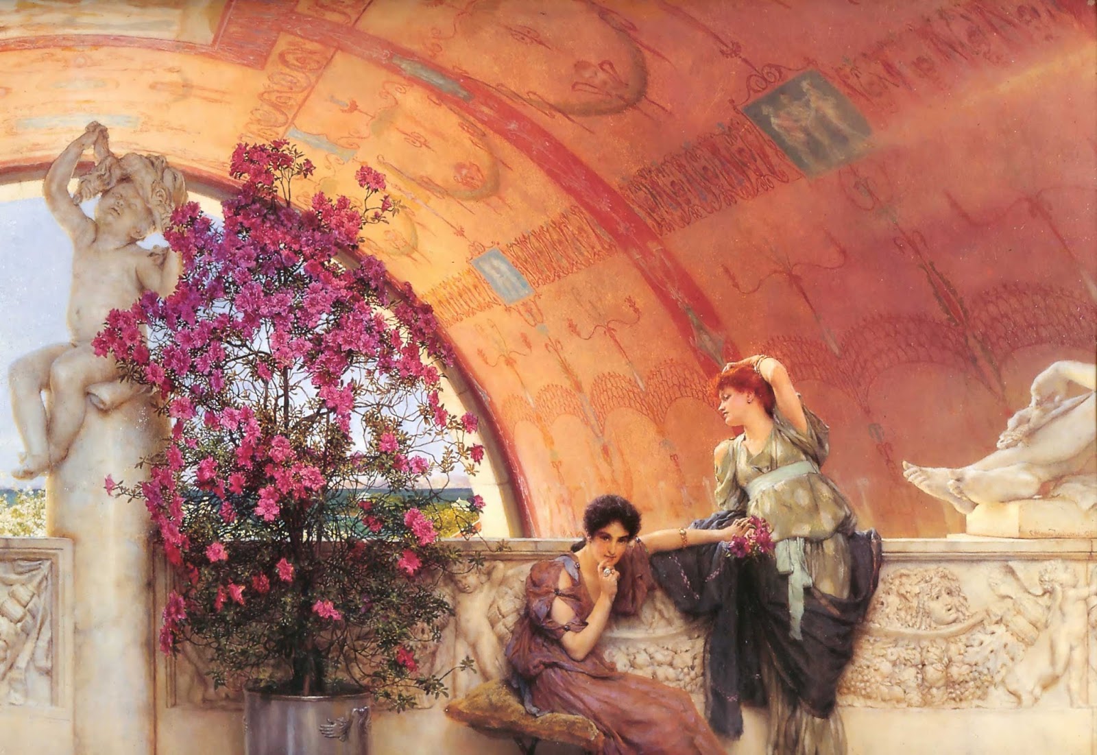
Last November, when AA and I were in Amsterdam, we took a day trip to Leeuwarden to see the new exhibition Alma-Tadema, klassieke verleiding (Alma-Tadema: At Home in Antiquity). My review of the exhibition has just been published in Nineteenth-Century Art Worldwide, which you can read here for free. One painting in the exhibition, that you see above, is Unconscious Rivals, 1893, from the collection of the Bristol Museum & Art Gallery. My own first exposure to Alma-Tadema was through a reproduction poster of this painting in the mid-1990s, when my mother fell in love with it and we worked together at a framer getting it matted and framed. It thereafter hung in my parents' bedroom for about fifteen years. I was always fascinated by the incredible details in the picture: the glean of the marble benches; the vibrancy of the azaleas; the details in the barrel-vault ceiling. Even more intriguing, however, was the psychological relationship between the two women depicted. I remember my mother and I talking about this when we first saw it, and I think this was the added bonus, in addition to the exquisite details, that sold us on purchasing the poster and framing it.
Regardless of whether or not one likes Alma-Tadema's work, most agree that his attention to detail and ability to paint furniture, drapery, jewelry, architectural settings, etc., are noteworthy. As I write in my review of the exhibition, I was eager to see this particular painting in the show, more so because of my own personal connection to it through that poster. On first seeing Unconscious Rivals in person, however, I admit I was a little disappointed because it is smaller than I had anticipated. This is not an uncommon experience after first engagements through reproductions. But the more closely I examined the painting, the more I could see that it was a jewel of a picture with intricate details like the azaleas, which are almost too hyperrealistic in their depiction.
The scene shows two young women who respond differently to an unseen man with whom each of them, unbeknownst to the other, is in love. (The man, presumably a soldier, is represented by the legs and sword of an ancient statue of a seated gladiator.) This narrative in the picture was part of the tradition of nineteenth-century genre painting, which audiences of the day appreciated and understood well. However, while traditional genre painting offered a moral message, here aesthetics take precedence and the depiction of the two women is more a statement about beauty rather than morality. The viewer (then and now) can identify with them, sympathizing with the shy temperament of the brunette who gazes toward the picture plane with a sheepish smile, or responding sensually to the vivacious red-head (a Pre-Raphaelite trope of the femme fatale) flirting with the lover below the balcony. The painting is a reinterpretation of the allegorical sacred and profane that stretches backward to Titian and forward to Freud. Alma-Tadema’s Unconscious Rivals relies on this form of empathy that transcends time and nationalism to make its point. It appeals to audiences to identify with these women emotionally, regardless if the women or the viewer are ancient Roman, British Victorian, or twenty-first century Dutch or American. It is, indeed, a beautiful painting. You can see more of his paintings, and some gallery views from the exhibition, in my review.
Wednesday, January 18, 2017
MWA: 31-40
I find it fascinating to go back through bklynbiblio at times and see some of what I had posted in the past. Back in March 2012, I wrote the first Monthly Work of Art post (Paul Cézanne's Tulips), and while I've been unable maintain this project every month as I had hoped (life sometimes gets in the way!), the response from people has motivated me to keep it going. It also often turns into a wonderful educational opportunity--for me! After all, as they say, what better way to learn something than to teach others about it!
Last time I posted a summary of MWAs 21-30, I wrote a preamble about the importance of the project as a form of beauty, how I believe art can be a panacea for the ills and tragedies we experience in life. I still feel that way, and I hope I never lose that. It's been a pleasure to share these works of art with readers, because each has touched me personally, whether it is from a personal encounter or a cultural phenomenon, a seasonal change or an intellectual endeavor. Even more rewarding is that they have impacted others as well.
The Good Shepherd sculpture, late 3rd century, from the Vatican still remains the most popular of the MWAs, currently with 792 views. Friedrich Overbeck's Italia and Germania, 1828, has taken over as second-most-popular with 415 views. The third & fourth are almost a tie: Florine Stettheimer, A Model (Nude Self-Portrait), ca.1915 (362 views) and Edouard Manet, Repose, ca.1870-71 (361 views). Here is a run-down of the works I selected for MWAs 31-40 with links to the posts and their number of views. As you can see from the image above, Houdon's Winter is the most popular of this group.
XXXI. Duccio, Madonna and Child, ca.1290-1300 (81 views)
XXXII. Jean-Antoine Houdon, Winter, 1787 (133 views)
XXXIII. John Everett Millais, Spring (Apple Blossoms), 1856-59 (84 views)
XXXIV. Charles-François Daubigny, The Sandpits near Valmondois, 1870 (98 views)
XXXV. Anthony van Dyck, Portrait of James Stuart (1612-1655), Duke of Richmond and Lennox, 1633-34 (104 views; image left)
XXXVI. Botticelli, Mystic Nativity, ca.1500 (26 views)
XXXVII. Frederick Childe Hassam, Late Afternoon, New York, Winter, 1900 (60 views)
XXXVIII. Thomas Gainsborough, The Blue Boy, 1770 (45 views)
XXXIX. Edward Steichen, Gloria Swanson, 1924 (77 views)
XL. J.M.W. Turner, The Burning of the Houses of Lords and Commons, October 16, 1834, 1834-35 (83 views)
Last time I posted a summary of MWAs 21-30, I wrote a preamble about the importance of the project as a form of beauty, how I believe art can be a panacea for the ills and tragedies we experience in life. I still feel that way, and I hope I never lose that. It's been a pleasure to share these works of art with readers, because each has touched me personally, whether it is from a personal encounter or a cultural phenomenon, a seasonal change or an intellectual endeavor. Even more rewarding is that they have impacted others as well.
The Good Shepherd sculpture, late 3rd century, from the Vatican still remains the most popular of the MWAs, currently with 792 views. Friedrich Overbeck's Italia and Germania, 1828, has taken over as second-most-popular with 415 views. The third & fourth are almost a tie: Florine Stettheimer, A Model (Nude Self-Portrait), ca.1915 (362 views) and Edouard Manet, Repose, ca.1870-71 (361 views). Here is a run-down of the works I selected for MWAs 31-40 with links to the posts and their number of views. As you can see from the image above, Houdon's Winter is the most popular of this group.
XXXI. Duccio, Madonna and Child, ca.1290-1300 (81 views)
XXXII. Jean-Antoine Houdon, Winter, 1787 (133 views)
XXXIII. John Everett Millais, Spring (Apple Blossoms), 1856-59 (84 views)
XXXIV. Charles-François Daubigny, The Sandpits near Valmondois, 1870 (98 views)
XXXV. Anthony van Dyck, Portrait of James Stuart (1612-1655), Duke of Richmond and Lennox, 1633-34 (104 views; image left)
XXXVI. Botticelli, Mystic Nativity, ca.1500 (26 views)
XXXVII. Frederick Childe Hassam, Late Afternoon, New York, Winter, 1900 (60 views)
XXXVIII. Thomas Gainsborough, The Blue Boy, 1770 (45 views)
XXXIX. Edward Steichen, Gloria Swanson, 1924 (77 views)
XL. J.M.W. Turner, The Burning of the Houses of Lords and Commons, October 16, 1834, 1834-35 (83 views)
Sunday, December 25, 2016
MWA XLV: Copley's Nativity
Merry Christmas! Yes, another year has passed, probably shocking all of our senses about how the days seem to be moving faster and faster... I decided on the image above as December's Monthly Work of Art, a rather unusual scene depicting the Nativity painted around 1776 by the Boston-born artist John Singleton Copley (1738-1815). This painting is in the collection of the Museum of Fine Arts, Boston, which holds the largest collection of Copley's works in the U.S. The picture measures approximately 24 x 30 in. and is oil on canvas. Copley likely painted this while he was in London, having traveled there in 1774 and spending 1775 in Paris, Rome, and Naples, where he would have been exposed to more Catholic-themed art than he would have seen in his homeland or in London at that time. The depiction reflects some influence of Italian and French Baroque art, with its use of shadows and lighting, but perhaps more so the influence of Benjamin West, another American who was on the rise to become one of London's leading History (i.e. narrative-scenes, not necessarily historical) painters of his day (West has appeared as an MWA too). The challenge Copley faced as an artist was that he, like all painters at this time, strove to become a History painter, which was considered at the time to be the top of the artistic hierarchy. Portraits, a format in which Copley had excelled in colonial America, was a way to make money. To be an Artist, one had to become a History painter. Although Copley had a few successes, by and large these pictures fail as compared to his portraits.
Take, for instance, the picture you see here, which is arguably one of the finest portraits of a child in all of Western painting. It is Copley's portrait of his younger half-brother Henry Pelham, entitled A Boy with a Flying Squirrel (1765). Copley able to capture his brother's likeness beautifully, but he also excelled in depicting drapery and clothing with different textures, and he had an uncanny ability to represent reflections (as in the veneer of the table) remarkably well. This picture was exhibited in London in 1766 and was a great success, largely because of his virtuoso skill in representing so many different types of surfaces. This success inevitably convinced Copley of the importance of making his way to London (then the art capital of the Western world) to develop his skills, but this would not happen for another decade.The Nativity, unfortunately, fails, then, when seen compared to Copley's portraits. There is nothing "wrong" with it in terms of execution, and the same things that Copley excelled in back in Boston--drapery, physical likeness, veneer--are somewhat evident here. But it lacks the gravitas of a religious painting and thus lacks in spiritual feeling. It is possible he was trying to make the figures more naturalistic and of his day, something 17th-century painters had done (e.g. putting Biblical figures in modern-day dress). But somehow it just doesn't work here. There is theatricality in the presentiment that borders on the melodramatic. The hand gestures and surprised looks seem like something out of a stage performance. The representation of Mary and the baby is perhaps the one area where one can feel a sense of sentimentality, but with her hand on her head and her overall look seeming more like a portrait of an 18th-century Londoner, it just seems all wrong. I posted this painting as the background of my page on Facebook for December, and although a few people "liked" it (some even "loved" it), the best part were some of the comments some of my "FB friends" made about it:
JT: "That is a weird painting."
MP: "Mary needs a nerve pill! Joseph invited all his friends over without telling her and she's already made the unfortunate decision to wear white in a manger.
CoCr: "Clearly she shops in Manger, Stable and Beyond."
DPG: "She looks like I did after giving birth, thinking OMG what have I done, I'm not ready to be a mother!"
CaCo: "Yeah she's looking like 'three hours sleep and Joseph brings all his mates round...'"
Art is supposed to create dialogue, so when it does it works. That doesn't always mean that the dialogue is positive. Sometimes even great painters make mediocre paintings. And on that note...Merry Christmas!
Tuesday, November 29, 2016
MWA XLIV: Roelofs's Windmill
Better late than never, as they say! I realize I've been offline with the blog the past few months, but it's largely because I have been so busy and working on a few writing projects in my non-job time. As I mentioned in a previous post, AA & I took a week-long vacation over Thanksgiving to go to Amsterdam and Copenhagen: two cities I had never visited before. It was quite a nice trip. The weather was cool and it rained a lot in Amsterdam, but I truly enjoyed the canals and the charming architecture in Amsterdam, and the majesty of the Nordic palazzo and upscale fishing village feel one finds in Copenhagen. We hit just about every major museum, not surprisingly. It was at the Rijksmuseum where I discovered this gem of a painting from the 19th century: Willem Roelofs, Meadow Landscape with Cattle, ca. 1880. We did not venture to the picturesque regions of The Netherlands where one can see old, working windmills such as the one in this painting, so this will have to suffice for me for the time being...until I get back and see them live.
Roelofs was a member of The Hague School, a group of artists who were inspired by the French Barbizon school of painters, such as Rousseau, Millet, and Corot. These artists began painting the naturalistic landscape of the French countryside as early as the 1830s but came into their own by mid-century, thereafter helping to alter the respectability of landscape painting from something dismissed as a lesser art in prior generations. This idea of depicting the naturalistic landscape as it actually appears, rather than as an idealized scene for a narrative event, arguably goes back to British artists such as Constable and Turner, but in The Netherlands the most obvious source of inspiration goes back even further to the 17th century with the naturalistic Dutch landscapes by artists such as Ruisdael. You can read more about The Hague School here.
While there is an incredible charm to this painting because of the windmill and the beautiful, soft lighting and fluffy clouds, what is striking is how the windmill dominates the space in this vertical painting. Normally one expects to see landscapes as horizontal compositions, panoramic views that show sweeping swathes of nature. Here, however, by reverting to a vertical format, Roelofs transforms the windmill into a portrait, or at least a narrative composition. The pyramidal structure of the windmill and its arms dominate the center point and then moving out diagonally toward the lower left and right lines, creating a pseudo-head-and-shoulders figure. Although the title references the cattle, both they and the man are diminished by the monumentality of the windmill itself, a man-made machine that for the 19th-century viewer demonstrated the development of technology, i.e. man's dominance over nature. Even the arms of the windmill seem to be moving the air and clouds themselves with a superior strength--which is exactly what they are meant to. This interpretation may seem rather droll because the painting is quite beautiful. But this is where Roelofs succeeds. He portrays the power of the windmill as an object of beauty, conveying both its picturesque qualities and the harmonizing of man with nature.
Roelofs was a member of The Hague School, a group of artists who were inspired by the French Barbizon school of painters, such as Rousseau, Millet, and Corot. These artists began painting the naturalistic landscape of the French countryside as early as the 1830s but came into their own by mid-century, thereafter helping to alter the respectability of landscape painting from something dismissed as a lesser art in prior generations. This idea of depicting the naturalistic landscape as it actually appears, rather than as an idealized scene for a narrative event, arguably goes back to British artists such as Constable and Turner, but in The Netherlands the most obvious source of inspiration goes back even further to the 17th century with the naturalistic Dutch landscapes by artists such as Ruisdael. You can read more about The Hague School here.
While there is an incredible charm to this painting because of the windmill and the beautiful, soft lighting and fluffy clouds, what is striking is how the windmill dominates the space in this vertical painting. Normally one expects to see landscapes as horizontal compositions, panoramic views that show sweeping swathes of nature. Here, however, by reverting to a vertical format, Roelofs transforms the windmill into a portrait, or at least a narrative composition. The pyramidal structure of the windmill and its arms dominate the center point and then moving out diagonally toward the lower left and right lines, creating a pseudo-head-and-shoulders figure. Although the title references the cattle, both they and the man are diminished by the monumentality of the windmill itself, a man-made machine that for the 19th-century viewer demonstrated the development of technology, i.e. man's dominance over nature. Even the arms of the windmill seem to be moving the air and clouds themselves with a superior strength--which is exactly what they are meant to. This interpretation may seem rather droll because the painting is quite beautiful. But this is where Roelofs succeeds. He portrays the power of the windmill as an object of beauty, conveying both its picturesque qualities and the harmonizing of man with nature.
Tuesday, September 27, 2016
Gibson Exhibition and Essays
bklynbiblio readers may recall that my doctoral dissertation was on the British sculptor John Gibson (1790-1866), about whom I have blogged a few times over the years. (The image you see here is a ca. 1850 portrait of Gibson by Edwin Landseer, from the collection of the Royal Academy of Arts in London.) My dissertation was the first in the United States--and, I believe, in the United Kingdom--on the artist. Since I finished and defended, I've been working on spin-off essays. One of these was published last December, focusing on Gibson's interest in reproductive media such as prints, statuettes, and cameos as a way to disseminate the classicism for modern audiences.
Last week another essay of mine, entitled "The Sculptor, the Duke, and Queer Art Patronage: John Gibson's Mars Restrained by Cupid and Winckelmannian Aesthetics," was released in the new book Rome, Travel and the Sculpture Capital, c.1770-1825. The book was edited by my colleague Tomas Macsotay, whom I met years ago when we were both in Leeds on different fellowships. This latest essay may seem familiar to some as I have presented different versions of the subject at conferences in Montreal and Storrs, Connecticut. This is standard practice, as it allows for opportunities to "test the waters," so to speak, and see how arguments are received by peers before publishing them. I reread my essay on the subway today and, while I think it still holds up, I confess my chronic (obsessive?) need to re-edit my own work makes me wish I had changed a few things. For instance, I think that in a revised version I would likely not be so "all"-encompassing in certain parts, and qualify matters by saying things like "selective" and "most" instead. Nevertheless, I am hopeful that the essay is a valuable contribution to the literature on the homoerotics of neoclassical sculpture, and that it will add to an increased appreciation on Gibson himself.
Later this year I have another Gibson essay coming out in the book The British School of Sculpture, c.1760-1832. This forthcoming essay relies more on biography and art-historical interpretation to consider the origins of Gibson's training and career before he moved to Rome in 1817 and set up a studio where he lived the rest of his life. That essay should be released around the time I go to a planned study day on Gibson in mid-December. This meeting (details are still under wraps) will be held in association with the new exhibition John Gibson RA: A British Sculptor in Rome, which opened a few weeks ago at the Royal Academy in London. Among the works on display is this one: The Meeting of Hero and Leander, ca. 1842, plaster (Collection: Royal Academy). This exhibition commemorates the 150th anniversary of Gibson's death, but surprisingly it is also the first monographic exhibition of Gibson's work since he died in 1866. Because he had bequeathed a substantial sum of money and numerous plaster casts and drawings to the RA, perhaps there never was a need to hold an exhibition in his memory as his bequest led to the opening of the Gibson Gallery to allow visitors and students to learn directly from his classical figures from the nineteenth century. But of course no one from his day foresaw the decline of classicism and the rise of abstraction, so that by the 1960s it is not surprising to know that the Gibson Gallery was taken down and the works scattered about and kept in storage.
This new exhibition has been curated by my colleagues Annette Wickham and Anna Frasca-Rath. There is a small publication, but to date I have not seen it, or the show, so I cannot comment on them. Anna (who completed her dissertation on Gibson in Vienna about a year or so after me) also has spear-headed the beautifully-designed online digital project The Gibson Trail, which provides images of his works with short essays, as well as a map outlining a 6-mile circle in London where one can view examples of his sculptures at places such as Westminster Abbey, the Tate, Buckingham Palace, and of course the RA. It's all quite impressive. In fact, I admit I'm a little envious of what they've accomplished. When one works so hard on a project, particularly a monographic project, one often becomes possessive over their individual. As a result it is difficult to acknowledge that one doesn't "own" that artist and that others are allowed to do work on him/her as well. In fact, they likely are doing equal (or even better!) work than oneself. So, inevitably, there can be a feeling of competition among us. (Some academics relish in this competition; these same academics also need serious therapy.) That said, one hopes that we still celebrate our collective achievements, because we are all working on the belief and spirit that this artist's masterpieces deserve reexamination and his career reevaluated and triumphed for what he accomplished at a particular moment in time. I am looking forward to seeing this exhibition and participating in the upcoming programs later this year. It will be a great opportunity for all the "Gibsonites" to come together and have a collegial meeting of the classical minds.
Last week another essay of mine, entitled "The Sculptor, the Duke, and Queer Art Patronage: John Gibson's Mars Restrained by Cupid and Winckelmannian Aesthetics," was released in the new book Rome, Travel and the Sculpture Capital, c.1770-1825. The book was edited by my colleague Tomas Macsotay, whom I met years ago when we were both in Leeds on different fellowships. This latest essay may seem familiar to some as I have presented different versions of the subject at conferences in Montreal and Storrs, Connecticut. This is standard practice, as it allows for opportunities to "test the waters," so to speak, and see how arguments are received by peers before publishing them. I reread my essay on the subway today and, while I think it still holds up, I confess my chronic (obsessive?) need to re-edit my own work makes me wish I had changed a few things. For instance, I think that in a revised version I would likely not be so "all"-encompassing in certain parts, and qualify matters by saying things like "selective" and "most" instead. Nevertheless, I am hopeful that the essay is a valuable contribution to the literature on the homoerotics of neoclassical sculpture, and that it will add to an increased appreciation on Gibson himself.
Later this year I have another Gibson essay coming out in the book The British School of Sculpture, c.1760-1832. This forthcoming essay relies more on biography and art-historical interpretation to consider the origins of Gibson's training and career before he moved to Rome in 1817 and set up a studio where he lived the rest of his life. That essay should be released around the time I go to a planned study day on Gibson in mid-December. This meeting (details are still under wraps) will be held in association with the new exhibition John Gibson RA: A British Sculptor in Rome, which opened a few weeks ago at the Royal Academy in London. Among the works on display is this one: The Meeting of Hero and Leander, ca. 1842, plaster (Collection: Royal Academy). This exhibition commemorates the 150th anniversary of Gibson's death, but surprisingly it is also the first monographic exhibition of Gibson's work since he died in 1866. Because he had bequeathed a substantial sum of money and numerous plaster casts and drawings to the RA, perhaps there never was a need to hold an exhibition in his memory as his bequest led to the opening of the Gibson Gallery to allow visitors and students to learn directly from his classical figures from the nineteenth century. But of course no one from his day foresaw the decline of classicism and the rise of abstraction, so that by the 1960s it is not surprising to know that the Gibson Gallery was taken down and the works scattered about and kept in storage.
This new exhibition has been curated by my colleagues Annette Wickham and Anna Frasca-Rath. There is a small publication, but to date I have not seen it, or the show, so I cannot comment on them. Anna (who completed her dissertation on Gibson in Vienna about a year or so after me) also has spear-headed the beautifully-designed online digital project The Gibson Trail, which provides images of his works with short essays, as well as a map outlining a 6-mile circle in London where one can view examples of his sculptures at places such as Westminster Abbey, the Tate, Buckingham Palace, and of course the RA. It's all quite impressive. In fact, I admit I'm a little envious of what they've accomplished. When one works so hard on a project, particularly a monographic project, one often becomes possessive over their individual. As a result it is difficult to acknowledge that one doesn't "own" that artist and that others are allowed to do work on him/her as well. In fact, they likely are doing equal (or even better!) work than oneself. So, inevitably, there can be a feeling of competition among us. (Some academics relish in this competition; these same academics also need serious therapy.) That said, one hopes that we still celebrate our collective achievements, because we are all working on the belief and spirit that this artist's masterpieces deserve reexamination and his career reevaluated and triumphed for what he accomplished at a particular moment in time. I am looking forward to seeing this exhibition and participating in the upcoming programs later this year. It will be a great opportunity for all the "Gibsonites" to come together and have a collegial meeting of the classical minds.
Saturday, July 30, 2016
MWA XL: Turner's Burning
Few would disagree that one of the greatest painters of the nineteenth century was Joseph Mallord William Turner (1775-1851). An artist who specialized in landscapes that ranged from the classical to the sublime, he so impressed his contemporaries with his work as a young man that he was elected an Associate of the Royal Academy in 1799 and a full member in 1802. He excelled both in oil paintings and watercolors, and could paint in the spirit of the Old Masters while also introducing something new for his own modern world. Later in life Turner was criticized for his eccentricities in subjects and painting techniques, and the recent biopic Mr. Turner reportedly makes him a bit of a bumbling idiot rather than an eccentric painter (I have not seen the movie yet). During the last twenty years of his life he failed to impress most viewers, and he was often derided for his paintings because of their seemingly slipshod compositions and abstractions of color. His one defender late in life was the conservative art critic John Ruskin, who saw in Turner (perhaps surprisingly) the epitome of the principle of "truth to nature." Today, Turner is recognized as a master, and retroactively appreciated as a key figure who influenced many of the modernist tendencies in painting from the Impressionists through Abstract Expressionism.
I've selected as this Monthly Work of Art Turner's painting The Burning of the Houses of Lords and Commons, October 16, 1834, which he painted from 1834-35 and now is in the collection of the Philadelphia Museum of Art. AA and I saw the painting once again on a visit there a few weeks ago, and it still continues to impress me every time. On the night of October 16, 1834, a tremendous conflagration burned down the Houses of Parliament in London. (The neo-Gothic building and Big Ben were the replacement buildings that stand today.) Hundreds, if not thousands, of spectators flocked to the shores of the Thames to watch the massive fire. Turner was among them, and he recorded on the spot a series of watercolor sketches that he later used to create two different oil paintings in his studio. This is one of them; the other is in the Cleveland Museum of Art. All of these works were cleverly brought together in 2007 when the National Gallery of Art in Washington, DC hosted the exhibition J.M.W. Turner. I remember to this day how much I loved this one particular room that demonstrated Turner's understanding of energy and light and color in his watercolors and the oil paintings recording this cataclysmic event.
Christopher Riopelle writes in the PMA's handbook about this painting that Turner watched the blaze from the south bank of the Thames: "Here he exaggerates the scale of Westminster Bridge, which rises like a massive iceberg at right and then on the opposite bank seems to plunge down and dissolve in the blaze. At the dazzling heart of the flames is Saint Stephen's Hall, the House of Commons, while beyond the towers of Westminster Abbey, which would be spared, are eerily illuminated. Turner was drawn to depictions of nature in cataclysmic eruption, and here in the middle of London he confronted a scene of terrifying force and drama that he recorded in several watercolor sketches and two paintings."
Turner's vibrant palette of color and the swirls of energy emanating from the fire make this a magnificent painting. Even the smoke takes on a life of its own as it rushes like a wave into the night sky. One can understand why people today often see Turner as a proto-abstract painter. I am reading at present Jonathan Crary's Techniques of the Observer: On Vision and Modernity in the Nineteenth Century, and a passage recently caught my eye (no pun intended) that made me think of this painting again from my visit to Philadelphia a few weeks ago. Crary's interest in this book is demonstrating how advances in physiology and socio-philosophical theory during the first half of the nineteenth century impacted the world of painting and the development of photography thereafter. Rather than reinforce the paradigmatic argument that modernist painters, from the Impressionists on, were so radical in how they saw the world as artists, he contends that their sense of the world was a natural development because of changes in the understanding of how people actually saw and perceived the world around them through scientific discoveries and hypotheses made earlier in the century. This led some to want to understand the essence of the "innocent" eye, what one sees before the brain interprets the imagery. Crary writes: "Ruskin was equally able to employ [this theory] in suggesting the possibility of a purified subjective vision, of an immediate and unfiltered access to the evidence of this privileged sense. But if the vision of Ruskin, Cezanne, Monet, and others has anything in common, it would be misleading to call it 'innocence.' Rather it is a question of a vision achieved at great cost that claimed for the eye a vantage point uncluttered by the weight of historical codes and conventions of seeing, a position from which vision can function without the imperative of composing its contents into a reified 'real' world." (pp.95-96)
What strikes me is that if we believe Crary's argument (and I confess I am doing a hack job summarizing it; read the book), then why do we have to leave it to the Impressionists in the 1870s to receive the credit for a new interpretation of this understanding of vision? Surely other artists experimented with these discoveries earlier? Indeed, Turner paints what his eye sees, not necessarily a photorealistic representation of what the viewer expects to see. He painted swirls of color as the eye sees them, but before the brain's interpretation of what they are. While this seems most apparent in the color and brushstroke of the background and upper left quadrant, other components of visual acuity are evident here too: the bridge, with its warped foreshortening and perspective. As the eye focuses on the rising flames of orange, yellow, and red, peripheral vision skews the natural alignment of the bridge. Similarly, the people in the foreground along the banks lack any physical features; they are shrouded in smoke and the night sky, and are only visible again in Turner's periphery. This painterly demonstration of what Turner "saw" relates well, then, to Ruskin, who praised Turner for his "truth to nature" approach in his art. It is not so much that his paintings capture a verisimilitude of the landscape; rather, his paintings convey an unadulterated understanding of what his eye saw. Such is the genius of Turner.
POSTSCRIPT 8/6/16: When I wrote this blog post, I was only just more than half-way through Crary's Techniques of the Observer. I should have glanced ahead. In his last chapter, Crary discusses Turner as exactly the prime example of artist who utilized new principles of vision in his art. He discusses briefly two of Turner's paintings from the 1840s that emphasize the vortex of light as their subjects. These paintings and Turner's late color/light-filled experiments are among those works most find inspiring today, largely because of their foreshadowing of abstraction yet to come. But for Crary it was the natural development of the understanding of a subjective sense of vision that made this possible. He writes: "Seemingly out of nowhere, [Turner's] painting of the late 1830s and 1840s signals the irrevocable loss of a fixed source of light, the dissolution of a cone of light rays, and the collapse of the distance separating an observer from the site of optical experience. ... Turner's direct confrontation with the sun ... dissolves the very possibility of representation that the camera obscura was meant to ensure. His solar preoccupations were 'visionary' in that he made central in his work the retinal processes of vision." (138-39) Crary thus utilizes Turner as the grande finale to his thesis. Fortunately, this coincides with my observation above: that one need not wait for the 1870s and the Impressionists to assume that scientific understandings in the subjectivity of vision manifested themselves in art. They were happening simultaneously.
Saturday, February 20, 2016
Art Details: 6 to 10
Image Credits: All images taken by bklynbiblio/Roberto C. Ferrari. Top to bottom:
- Dying soldier from east pediment, Temple of Aegina, Greece, late 5th century BCE, marble, Glyptothek, Munich.
- Frederic, Lord Leighton, The Music Lesson, 1877, oil on canvas, Guildhall Art Gallery, London.
- Jean-Léon Gérôme, Moorish Bath, 1870, oil on canvas, Museum of Fine Arts, Boston.
- Claude Monet, Boulevard des Capucines, 1873-74, oil on canvas, Nelson-Atkins Museum of Art, Kansas City.
- Botticelli, Madonna of the Magnificat, late 15th century, oil on canvas, Uffizi Gallery, Florence.
Labels:
19th-century art,
ancient art,
art details,
England,
France,
Germany,
Greece,
Impressionism,
Italy,
landscapes,
Massachusetts,
Missouri,
oil paintings,
religion,
Renaissance,
sculpture,
Victorian
Saturday, February 6, 2016
MWA XXXVIII: Gainsborough's Boy
The picture you see here is one of those images that has been reproduced so many times that you know it instantly, even if you aren't sure who it is or who painted it. This is Thomas Gainsborough's Blue Boy, painted in 1770, from the The Huntington Library, Art Collections, and Botanical Gardens. I have never seen this picture in person, because I have never been to this institution--yet! But like anyone who has seen it I have always been fascinated by the boy's overtly confident, almost cocky, facial expression and pose, and the vibrancy and bravura of the blue garments that Gainsborough painted. I chose this work for February's Monthly Work of Art because I recently read Martin Postle's short book on Gainsborough. Rather than do my own interpretation of this painting, then, here are the words of specialists who know much more about this than I do.
This painting "was Gainsborough’s first attempt at full length Van Dyck dress--knee breeches and a slashed doublet with a lace collar--which is based on the work of Anthony van Dyck, the 17th-century Flemish painter who had revolutionized British art. ... Though clearly indebted to Van Dyck, Gainsborough’s painting technique was entirely his own. Whereas Van Dyck applied color in discrete patches composed of short consecutive strokes, Gainsborough presents a chaos of erratic color and brushstrokes. The shimmering blue satin is rendered in a spectrum of minutely calibrated tints--indigo, lapis, cobalt, slate, turquoise, charcoal, and cream--that have been applied in extremely complex layers of vigorous slashes and fine strokes. At the proper distance, the diverse pigments crystallize into an illusion of solidity." (online catalogue entry)
"The Blue Boy is Gainsborough's most famous picture, and his most enigmatic. Through its elevation to iconic status in the twentieth century this picture, more than any other, has served to promote the artist's image as a romantic painter of chocolate-box cavaliers. Nothing could be further from the truth. The painting is a parody. The boy in question was not the offspring of an aristocrat but the teenage son of a prosperous Soho ironmonger, and a person friend of the artist. His costume was a popular form of fancy dress which ... was otherwise restricted to the ephemeral realm of the masquerade, then a popular form of entertainment in the capital. ... X-rays have revealed that Gainsborough painted The Blue Boy upon a discarded, cut-down canvas, which further suggests that this was not a straight-forward portrait commission but an impromptu jeu d'esprit." -- Martin Postle, Thomas Gainsborough (Princeton, NJ: Princeton UP, 2002), 46.
This painting "was Gainsborough’s first attempt at full length Van Dyck dress--knee breeches and a slashed doublet with a lace collar--which is based on the work of Anthony van Dyck, the 17th-century Flemish painter who had revolutionized British art. ... Though clearly indebted to Van Dyck, Gainsborough’s painting technique was entirely his own. Whereas Van Dyck applied color in discrete patches composed of short consecutive strokes, Gainsborough presents a chaos of erratic color and brushstrokes. The shimmering blue satin is rendered in a spectrum of minutely calibrated tints--indigo, lapis, cobalt, slate, turquoise, charcoal, and cream--that have been applied in extremely complex layers of vigorous slashes and fine strokes. At the proper distance, the diverse pigments crystallize into an illusion of solidity." (online catalogue entry)
"The Blue Boy is Gainsborough's most famous picture, and his most enigmatic. Through its elevation to iconic status in the twentieth century this picture, more than any other, has served to promote the artist's image as a romantic painter of chocolate-box cavaliers. Nothing could be further from the truth. The painting is a parody. The boy in question was not the offspring of an aristocrat but the teenage son of a prosperous Soho ironmonger, and a person friend of the artist. His costume was a popular form of fancy dress which ... was otherwise restricted to the ephemeral realm of the masquerade, then a popular form of entertainment in the capital. ... X-rays have revealed that Gainsborough painted The Blue Boy upon a discarded, cut-down canvas, which further suggests that this was not a straight-forward portrait commission but an impromptu jeu d'esprit." -- Martin Postle, Thomas Gainsborough (Princeton, NJ: Princeton UP, 2002), 46.
Sunday, January 17, 2016
MWA XXXVII: Hassam's Winter
I know I am not alone when I say that winter landscape scenes are perhaps some of my most favorite subjects in paintings. There is something breathtaking in the vision of falling and new-fallen snow that many artists over the centuries have attempted to represent, knowing full well this is an idealistic sense of reality. In our automobile/truck-occupied world today, snow plows and vehicles quickly make the snow disgusting, slush turns gray and gross, and for all eternity neighborhood dogs like to...how should we say?...turn white snow yellow as fast as they can! Nevertheless, there is something tranquil about watching snow fall from the skies, then afterward listening to children play in the snow and wandering out in the crisp air admiring the effect of the snow on trees and houses. Snow is about the power of nature to purify and cleanse, and in a major city like New York it is fascinating to see how snow even here can diminish the noise and bustle of the urban environment and make it as serene as a country landscape, if but for a short while. It is the white-ness of new-fallen snow, with its Western associations of purity and innocence, that has the power to blanket and coat the urban environment and create a visual sense of rebirth.
From a painter's perspective there is the trick of how to represent the actual effects of snow. It would seem easy to just use white paint, but light and shadows play tricks on snow, and one realizes there is no such thing as snow that is just one white hue. Artists such as Childe Hassam, in the work you see here as this Monthly Work of Art, used tones of icy blue in this representation of Central Park South/59th Street on a snowy late afternoon, just before twilight, suggesting how the setting sun's rays, at a sharp angle, give snow an iridescent quality. Hassam was one of the most successful American Impressionists. Influenced by Monet, Renoir, and Pissarro, Hassam and other Americans by the 1890s were absorbing the lessons they learned in Paris and introducing to an American audience their version of paintings that showed both the transience of modern American life, often using short, quick brushstrokes to suggest action and immediacy, but also playing with the visual effects of light on the world around them to create a unique vision of how the artist saw the world. Although I always admit that I am not a big fan of Impressionist painting, I certainly can appreciate the talents and skillful experiments many of these artists exuded. And, as in this case, I do love a beautiful winter landscape scene, particularly one that shows a historical view of New York.
Image credit: Frederick Childe Hassam (American, 1859-1935). Late Afternoon, New York, Winter, 1900, oil on canvas, 36 15/16 x 29 in., Brooklyn Museum, Dick S. Ramsay Fund, 62.68.
From a painter's perspective there is the trick of how to represent the actual effects of snow. It would seem easy to just use white paint, but light and shadows play tricks on snow, and one realizes there is no such thing as snow that is just one white hue. Artists such as Childe Hassam, in the work you see here as this Monthly Work of Art, used tones of icy blue in this representation of Central Park South/59th Street on a snowy late afternoon, just before twilight, suggesting how the setting sun's rays, at a sharp angle, give snow an iridescent quality. Hassam was one of the most successful American Impressionists. Influenced by Monet, Renoir, and Pissarro, Hassam and other Americans by the 1890s were absorbing the lessons they learned in Paris and introducing to an American audience their version of paintings that showed both the transience of modern American life, often using short, quick brushstrokes to suggest action and immediacy, but also playing with the visual effects of light on the world around them to create a unique vision of how the artist saw the world. Although I always admit that I am not a big fan of Impressionist painting, I certainly can appreciate the talents and skillful experiments many of these artists exuded. And, as in this case, I do love a beautiful winter landscape scene, particularly one that shows a historical view of New York.
Image credit: Frederick Childe Hassam (American, 1859-1935). Late Afternoon, New York, Winter, 1900, oil on canvas, 36 15/16 x 29 in., Brooklyn Museum, Dick S. Ramsay Fund, 62.68.
Sunday, January 3, 2016
Art Exhibitions of 2015
The end of each calendar year brings out all the art critics to write about the best art exhibitions they experienced that year. Because we live in the NYC area, with an incredibly rich cultural scene, we are fortunate that there is so much to see. Here, for instance, is the link to Holland Cotter and Roberta Smith's article on the best in the art world in 2015, which is quite comprehensive if thematic in its arrangement. Conscious of geography and its limitations to lists, I like that Hyperallergic does separate reviews for NYC and other parts of the world in their annual rankings, to create a more level playing field, it would seem. As for me, since I don't have the luxury, liberty, or time to see every exhibition in NYC, let alone in the world, I can only base my list on what I have been fortunate to see. This year I did see a lot, including a number of new museums and collections for the first time, listed at the end of this post. Below is my annual summary of what I felt were the best shows I saw this year (here is last year's post). And, for the record, I should note that I have not yet seen Picasso Sculpture at MOMA, partly because going to see an exhibition there is a total nightmare. Fortunately, it closes in about a month from now, so I still have time.
I still am surprised that no one I have encountered, read, or spoken to, ever saw what I consider to have been one of the best shows of 2015. Entitled Body and Soul: Munich Rococo from Asam to Günther, this exhibition (installation view above) brought together over 160 sculptures in polychrome wood, terracotta, silver, and stucco, as well as drawings and paintings and prints by a number of largely unknown sculptors based in Bavaria during the 1700s (hence the eponymous Asam brothers, Cosmas Damian and Egid Quirin Asam, working early in the century, to Ignaz Günther at the end). This exhibition was installed at the Kunsthalle in Munich, a space for rotating special exhibitions. The installations of many of these works was simply stunning. The exhibition was ecclesiastic in its focus (Bavaria, unlike the rest of Germany, historically remained Catholic), so one saw mostly angels and saints in the show. Normally installed in churches, cathedrals, and chapels, these works typically are part of elaborate, intricate architectural settings and interior spaces. Removing them and putting them on exhibition in this way, however, gave the viewer the opportunity to appreciate them as individualized works of art, with an emphasis on the sculptural quality of these figures, i.e. their materiality and craftsmanship, and occasionally their hyperrealistic theatricality. At the same time, removing them from their usually-ornate environments, the viewer appreciated how their contorted, exaggerated forms make them seem proto-surreal and modern. The image you see above was just one of the many rooms in which the stunning display of larger-than-life figures impressed viewers. It is unfortunate that this exhibition did not get more attention internationally. Despite the national focus, I suspect it is because it was largely religious in nature, and religion does not usually do so well with audiences today.
Two other sculpture shows that are high on my list derive from the ancient and contemporary art worlds. In Florence I saw at the Palazzo Strozzi the exhibition Power and Pathos: Bronze Sculpture of the Hellenistic World, which showcased intricate and often naturalistic works of art crafted from the period between Alexander the Great's death in 323 BCE and the foundation of the Roman Empire in 31 BCE (image left: Victorious Athlete, 300-100 BCE, bronze and copper, Getty). Drawn from collections worldwide, many of the objects were presented with interesting didactic panels that provided a broad context from how the bronze figures were made to their socio-economic and political uses. The exhibition was co-organized with The J. Paul Getty Center, and is currently still on show at present at the National Gallery in Washington, DC until March.In contrast to this ancient survey, the exhibition of works by Doris Salcedo at the Guggenheim here in NYC was absolutely worth visiting. I was first introduced to Salcedo a few years ago when she did the infamous "crack" Shibboleth in the floor of the Tate Modern Turbine Hall, which had some interest but seemed to rely too much on the conceptual for my taste. This year, however, the exhibition of a selection of her work clearly revealed her focus on her heritage growing up in Colombia during turbulent years in its history. Her works address violence, racism, and misogyny, but they also fool the mind with their use of unusual materials and the juxtaposition of hard and soft media that confuses the mind. The installation view seen here shows a series of historical wooden pieces of furniture that have had concrete poured into them. Making them useless as furniture, they take on a new function as archaeological monoliths that question ideas about the domestic sphere. An installation piece that changes with each space, these incredibly heavy objects challenge one's ideas about what constitutes space itself, then, and in the spirit of sculpture-as-objects the viewer is forced to engage with them in a way that blocks your entry and exit. Their monumentality and gravitas were provocative and almost tangible. The two criticisms I had about this exhibition, however, was that it was spread out through the galleries at the Guggenheim in a way that I found disconcerting and fractured. Secondly, it was absurd of the designers not to make the wall texts and panels bilingual. In this day and age in America, curators and designers have a responsibility to create Spanish texts in addition to English texts whenever they exhibit a Latino/a artist. (Brooklyn Museum successfully did this with their Francisco Oller exhibition, but alas I was not as thrilled about that show overall.)
Shirin Neshat: Facing History was on exhibition at the Hirshhorn Museum in Washington, DC, when AA and I visited there in June. Like with Salcedo, I had seen a few of Neshat's photographs and one film in the past, and was intrigued by her work, but this retrospective was amazing. I would go so far as to say it is #2 on my list of the best exhibitions I saw this year. Born in Iran in 1957, Neshat left in 1975, and her art work since then has addressed the turbulent politics of Islam and Iran's relationship with the West. She has staged historical recreations of important political events, uses multiple cameras to personify the divided worlds of men and women, and hand-manipulates exquisite black-and-white and color photographs with Persian texts, all in to draw attention to the crises we face in our ongoing political battles between Iran and the West to this day. Neshat is one of those artists whose work continues to have more relevance with each passing year as jihadists in the Near East continue to strike fear in the hearts of everyone--Christian, Muslim, Jew, Buddhist, everyone--in the world. The image you see here is a manipulated photograph from her 1993 series I Am Its Secret (Women of Allah) [Photo: Plauto © Shirin Neshat].On my list, I would next say that #3 is Archibald Motley: Jazz Age Modernist. On display at the new Whitney Museum of American Art, this show was an absolute delight. African-American of mixed-race heritage, Motley (1891-1981) was trained academically, but was influenced by modernist trends after World War I. His portraits of blacks, whites, and mixed-race people emphasize the wide array of complexions and social standings that exist in our world. He celebrated the advancements and opportunities that jazz gave to blacks in America and Paris, and clearly loved music and dance. The painting you see here, Tongues (Holy Rollers), 1929, is an exploration of the spirituality endemic in some black communities, but you also can see in the movement of their bodies that this is a dance, a paean to life-as-spirituality, and how jazz is influencing even how one can think about religion. This exhibition taught me about an American artist whose work I had little exposure to before now, and showed me beautiful paintings that made me go through the exhibition more than once to absorb all the colors, forms, compositions, and sensations. It made me appreciate yet again how incredibly fascinating the 1920s were in American art, a statement I have been making ever since I saw the incredible show Youth and Beauty: Art of the American Twenties at Brooklyn Museum in 2011. To wrap up this section, I should add that the Whitney Museum also deservedly gets kudos for the new Renzo Piano building in the Meatpacking District. They have done an amazing job of integrating public and private space, outdoor and indoor space, in one building, and in so doing have unexpectedly also created a charming new community in a neighborhood that culturally was on the rise but now has taken off.
To wrap up this post here are a few other honorable mentions from exhibitions I saw this year:
- I was delighted I had the opportunity to see Flaming June by Frederic, Lord Leighton, at The Frick (image right). This painting is one of those great pictures from posters and postcards that first inspired people to look anew at Victorian painting (even I had a poster of it!). Seeing this picture in person reminded me that Leighton is painterly and has a lush brushstroke, even though images make him seem to be a slick, linear classicist. Viewers love this painting for its sensual depiction of the young woman in her diaphanous draperies, and it does not disappoint in person. I also liked how the Frick installed the picture by two of their ladies by J. A. M. Whistler, cleverly demonstrating how the two were part of the Aesthetic Movement, which emphasized beauty in art without subject or moral meaning, but painted so differently.
- At the Metropolitan Museum of Art this year, one of their big successes has been Kongo: Power and Majesty, which I saw not too long ago. It is indeed an excellent installation and does a good job of not only showcasing beautiful examples of African art in numerous media, but also engaging well with issues such as slavery and post-colonialism with the Portuguese trade of this area from the 1600s to the 1900s.
- Another great Met Museum exhibition was Sargent: Portraits of Artists and Friends, not because it was a wonderful installation, but because everyone just loves gazing at and revelling in John Singer Sargent's bravura of a brushstroke.
- In contrast, Navigating the West: George Caleb Bingham and the River was not necessarily a beautiful exhibition, but it was very interesting learning more about this 19th-century painter based in Missouri drawn from scientific analysis of his paintings and looking more closely at his contemporary sources.
I will close this post by noting that I was fortunate to visit a few museums for the first time this year. These were, in no particular order: the Nelson-Atkins in Kansas City; the Barnes Foundation and the Pennsylvania Academy of Fine Arts in Philadelphia; the Galleria Nazionale dell'Arte Moderna in Rome (amazing unknown 19th-century art); the Guildhall Art Gallery in London (Victorian pictures galore!); and Dia:Beacon in upstate New York (whole new appreciation for Sol LeWitt's wall murals). I also had a great research trip to Boston and visited for the first time the Isabella Stewart Gardner Museum and the reconstituted Harvard Art Museums, and revisited for the first time in almost twenty years the Museum of Fine Arts, Boston. Amazing art, collections, installations, and exhibitions in these places...2015 was quite a great year.
Labels:
18th-century art,
20th-century art,
21st-century art,
American art,
art exhibitions,
Germany,
Greece,
installations,
Islam,
Italy,
museums,
New York,
oil paintings,
photography,
portraits,
religion,
reviews,
sculpture
Tuesday, December 29, 2015
Art Details: 1 to 5
About a year and a half ago, I started taking detail shots using my iPhone (now 6, then 4S) of paintings and sculptures in museums that I found particularly fascinating. Although I am an advocate of always seeing art in person to fully appreciate it, admittedly it is not always possible to do that. Thus, images can help supplement the live experience of art to some extent. Art details in particular arguably give us an opportunity to hone in on a work of art, to examine aspects of it so as to attempt to see deeper into the artist's intent or vision. Admittedly, these details also give the photographer (in this case me) an opportunity to be creative in interpreting these masterful works of art. After all, in seeing these, you are experiencing my detail, my interpretation, of these paintings and sculptures. Beauty, indeed, is in the eye of the beholder. I typically post these on my Instagram account, which you can see by clicking here. (Warning: fun, personal images are there too.) Below these 5 images, I've provided some metadata about each. Enjoy!
Image Credits: All photographs taken by bklynbiblio/Roberto C. Ferrari. Top to bottom:
- Albrecht Durer, The Paumgartner Altarpiece: The Birth of Christ, 1498-1504, oil on panel, Alte Pinakothek, Munich.
- Auguste Rodin, The Three Shades, originally designed for The Gates of Hell before 1886, 20th-century cast, bronze, Rodin Museum, Philadelphia.
- Dante Gabriel Rossetti, La Ghirlandata, 1873, oil on canvas, Guildhall Art Gallery, London.
- Paul-Albert Bartholomé, Congiunti al di là , 1891-99, marble, Galleria Nazionale dell'Arte Moderna, Rome.
- Sarah Miriam Peale, Still Life with Watermelon, 1822, oil on canvas, Harvard Art Museums, Boston.
Saturday, December 19, 2015
Auction Sales of 2015
Record-high prices from the art auction world continued to astound people this year, even those of us who work in the art industry. Of course, this is in modern/contemporary art, where prices for a handful of artists from the past 140 years (mostly 20th-century) continue to garner often shocking prices in the millions and alter the landscape (no pun intended) in the valuation of art. For instance, in May of this year, Christie's set a new record bringing in for the first time over $1 billion in a single week of sales: $658.5 million from their postwar/contemporary sale and $705.9 million from their 20th-century sale, each a few days apart from one another. Then, in November, Christie's made news with the record-breaking sale of the painting you see above, Amedeo Modigliani's Nu Couché (Reclining Nude), 1917-18. This picture sold for $170.4 million (with fees) to Chinese collector Liu Yiqian, a former taxi-driver, now billionaire, with a private museum in Shanghai. This record-breaker has earned the painting the number 2 spot on the most expensive works ever sold at auction (a Picasso also sold this year as number 1). Now, I like Modigliani's work a lot, but this nude...not so much. These other Modigliani nudes at the Met Museum and the Courtauld (the second one of my favorite paintings of the nude) are far superior in their execution than this one. I also think Modigliani's portraits are hauntingly fantastic, such as this portrait of Paulette Jourdain that sold this year at Sotheby's for $42.8 million (with fees) from the collection of their former CEO A. Alfred Taubman (a highly controversial figure himself). This record-breaking sale of a Modigliani has now effectively escalated the overall appreciation of his entire oeuvre. That may not seem to be a bad thing, because he is a great modernist, but this escalation in value also has skewed the market for his work in a way that costs museums and private collectors more money to insure his art works in their collections. On the surface this may not seem like a big deal, but when museums want to organize exhibitions, it costs them more to ship and insure these paintings, and as a result these costs trickle down to the average museum-goer in the form of higher ticket prices, book and merchandise sale increases, and other costs. The impact factor of these auction sales go beyond what a wealthy Chinese collector is willing to pay for a particular work of art.
Here is my new list of the Top 5 Auction Sales of Works of Art, which is an update of my 2013 post on this with extracted information from sites such as theartwolf and Wikipedia. (Keep in mind that this list is specific to auction sales and does not consider private sales, the most expensive of which is now in the range of $300 million for Paul Gauguin's painting Nafea Faa Ipoipo [When Will You Marry?].)
- Pablo Picasso, Les Femmes d'Alger (The Women of Algiers) ['Version O'], 1955, oil on canvas, sold May 2015, Christie's New York, $179.4m
- Amedeo Modigliani, Nu Couché (Reclining Nude), 1917-18, oil on canvas, sold November 2015, Christie's New York, $170.4m
- Francis Bacon, Three Studies of Lucian Freud, 1969, oil on canvas in three parts, sold November 2013, Christie's New York, $142.4m
- Edvard Munch, The Scream, 1895, pastel on board, sold May 2012, Sotheby's New York, $119.9m
- Pablo Picasso, Nude, Green Leaves and Bust, 1932, oil on canvas, sold May 2010, Christie's New York, $106.5m
In the world of British art, the picture you see here is of one of the more significant sales this year. The picture (taken by AA) shows me examining John Constable's The Lock, ca. 1824-25, when we visited Sotheby's New York in November to see the exhibition of upcoming works for auction. No, we weren't in the market to purchase it, as its estimate was in the millions of pounds/dollars range. This particular painting was number 5 of 6 in a series of Constable's famous "Six-Footer" paintings, i.e. landscapes that were elevated to the status of history paintings, but lacking a narrative. His paintings changed the history of art from the 1820s on when he exhibited them, as they opened up a new appreciation for the natural landscape as a large-scale, viable subject for artists and collectors. Constable's painting sold at Sotheby's London for £9.1m or $13.7m (with fees). (Note that another version of this same subject actually holds the record for Constable at auction, selling in 2012 £22.4m or $35.2m.). The sale of this painting now means that only two more major works by him are left in private hands.Also in British art, I was pleased to see that this work, Simeon Solomon's Priestess of Diana Offering Poppies, 1864, which has been on the market and in private sales over the years, sold for £43,750 or $65,800 this past week. This isn't a record for Solomon, as his 1871 oil painting Rabbi Holding the Scrolls of the Law sold for £142,400 or $280,460 in 2006, but this latest sale is a demonstrated strength in the market for Solomon's oeuvre overall. For an artist long-maligned because of his homosexual crimes, Solomon has come into his own as an important figure among the Pre-Raphaelite and Aesthetic artists of the Victorian period, and is now eagerly sought by collectors in this area. (You can see my Solomon blog posts here, and always remember to check the award-winning Simeon Solomon Research Archive which is co-managed by Carolyn Conroy and me.)
To wrap up this auction post, I must comment on what I consider to be one of the most bizarre sales of the year, another painting AA and I had the opportunity to see in person at Sotheby's: Carl Kahler's My Wife's Lovers, 1891. This was a commission to paint San Francisco socialite Kate Johnson's favorites cats from among her 350 of them. I am not making this up. The end result is mind-boggling painting to behold. It measures approximately 6 x 8 1/2 feet in size and is in an incredibly ornate frame. One can appreciate the attention to detail and emphasis on animal physiognomy, Kahler succeeding in capturing the characteristics of each individual cat. But the painting borders on the eccentric. The estimate price was $200,000-$300,000. It sold for $868,000 (with fees). All I keep thinking about this painting is that someone with a lot of empty wall space must really, really love cats. Here is Sotheby's video about the painting, which also shows you how popular in the press the picture was when it was completed almost 125 years ago.
Subscribe to:
Posts (Atom)