The annual
New York Times 100 Notable Books of 2018 came out a few weeks ago, and I was pleasantly surprised to discover that there were two books on the list this year that I already had an interest in:
The Sparsholt Affair by Alan Hollinghurst (which I bought but haven't read yet) and
Warlight by Michael Ondaatje (which I did actually read and found interesting, like a literary, Corot-like veiled-mist tale). Among the novels on this new list that intrigue me and are now on my
Amazon wish list are
The Witch Elm by Tana French,
Asymmetry by Lisa Halliday, and
The Overstory by Richard Powers. One major book not on their list because it came out afterward--and which, of course, is now on my "to read" list!--is Michelle Obama's
Becoming. AA is reading it, as is my friend MT, and both are totally absorbed.
The book cover you see above reflects what I would say is the best novel I read this year,
The Handmaid's Tale [1986]. Even though I have not seen the
new series, I decided to step into the infamous dystopian world created by Margaret Atwood over 30 years ago, and I was enthralled. The book is fantastic and frightening; it feels so real and plausible, particularly in light of how things are going these days politically. Even better, it's beautifully written, slow even at times, the protagonist paying attention to details and inner feelings and memories in a way that is haunting to read. Atwood announced recently she is writing a long-awaited sequel, about which I'm uncertain how I feel. Part of me is curious like others to know where Offred actually went and what happened to her, but another part of me worries the sequel will be too influenced by popular culture today and won't live up to the author's own masterful exploration into this disturbing futuristic, misogynistic world. Speaking of misogyny, last year about this time I was reading
Madame Bovary and I still think it was a beautifully written novel and highly recommend it to people all the time. It even topped my list of the the
best novels I read between 2014 and 2017! Other great novels that I read this year included: Julian Barnes's existentially obsessive biographical novel
Flaubert's Parrot [1984]; Penelope Fitzgerald's community of miserable, hateful people in
The Bookshop [1978]; the sad
Everything I Never Told You [2014] by Celeste Ng, which was on the
NYT 2014 list; and Ruth Rendell's foray into racism and murder with
Simisola [1994]. I also read this year the mid-century classic
Lolita [1955] by Vladimir Nabakov, and I absolutely hated this book, not even so much for the nauseating storyline but because the writing itself drove me nuts.
Since I wrote last year's post on
Books of 2017, I have read 32 books. I finally took the time to read
Sculpture: Processes and Principles [1977] by Rudolf Wittkower, with which I had familiarity but had not read in its entirety before now. It really is a fantastic overview about techniques in stone carving and modeling for anyone interested in knowing more about the great European sculptors of the past. Bridging the gap between art and biography, two of my favorites this year were
Art for the Nation: The Eastlakes and the Victorian Art World [2011] by Susanna Avery-Quash and Julie Sheldon, and self-described "tranny potter" Grayson Perry's memoirs, co-written with Wendy Jones,
Portrait of the Artist as a Young Girl [2006]. Another great biographical account was Richard Blanco's memoir
For All of Us, One Today: An Inaugural Poet's Journey [2013], which I read after we visited
the excellent exhibition of his poetry with photographs by Jacob Hessler in Ogunquit, Maine. In the realm of American history, I read Jon Meacham's new book
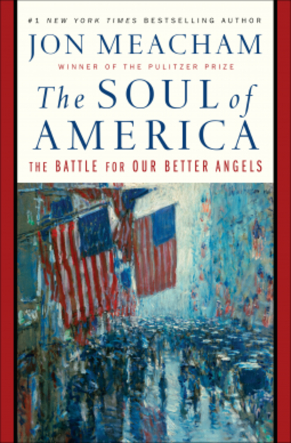
The Soul of America: The Battle for Our Better Angels [2018], the cover of which you see here. This book was such a fascinating overview of highlights in American history from the colonial period through the 1960s, showing how so many of our great leaders, including Lincoln and FDR, enacted social change because of the influence of the people, social activists and civil rights leaders, the true "soul of America." The book is a great testament and response to the politics of today.
Right now, I'm currently reading two books. On the literary fiction side, I am finally reading Jane Austen's
Persuasion, published posthumously two centuries ago. I am nearing the end and I am worried it won't have a happy ending! I'm also reading Richard Holmes's fantastic collective biography
The Age of Wonder: The Romantic Generation and the Discovery of the Beauty and Terror of Science [2010], reminding us that science was not the separate discipline we perceive it to be today, but part of the exploration of the natural world along with art, literature, and music in the decades before and after 1800. This book has made for some relaxing bedtime reading, before turning in and dreaming each night...